
FEATURED
Jackson Law Firm
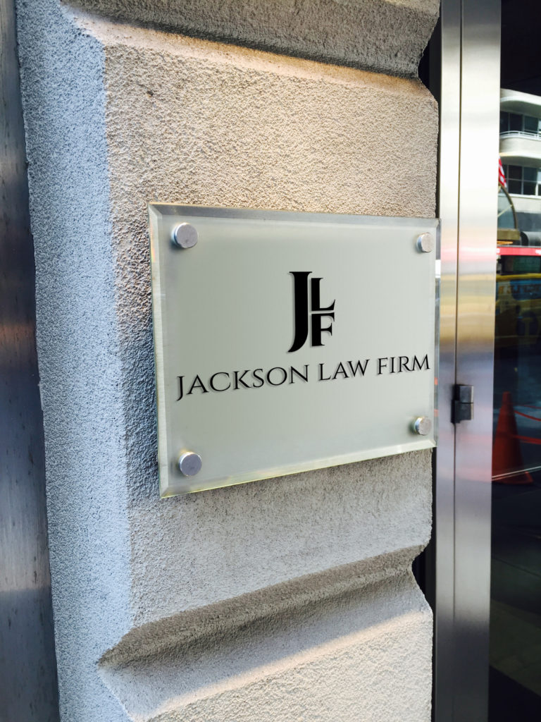

The Jackson Law Firm wanted to project their well established image in a up to date and elegant fashion. The sign portion of the project, shown here, was designed in the silver and ebony and the almost monogram like JLF provide the elegance aspect while the no-nonsense fonts more than imply 'well-established.' The simplicity of the design lent itself easily to their online impressions as well as their vast print arena.
The firm name and image is everything when it comes to the brotherhood of the bar. Demonstrating integrity in just the most specific way, this sign project was designed to provide partners, associates, and prospective and established clients with pride and satisfaction in their choice of law firms. Extending the same (yet smaller) image to print and internet presence further enhances the concept of exceeding client expectations with dignity and integrity.


