
FEATURED
WORKS & PROJECTS
Brewers Coffee House
Logo Design, Packaging Design, Branding
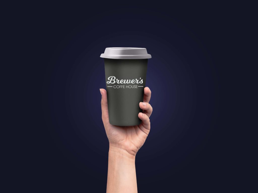

Inspired by the smokey coffee flavor, we chose the black and smoke-grey combination for this packaging to create a remembered feeling related to flavor experience. While the name of this lighthearted font is actually 'milk shake,' the sense of style was perfectly fitted to the sight and scent recall we desired for this delightful product and appreciative client.
Branding for The Brewers was deemed essential in the endeavor to differentiate from any other similar provider in the quickly-becoming-crowded java industry. The concept was to provoke scent and taste 'emotions' for both the serious coffee consumer as well as the light hearted cuppa-joes. And, yes, we take our coffee black, thank you.


